5 Ways Web Animation Can Help Your Business
April 12, 2018 11:37 am Leave your thoughts  Technology, including web animation, is a constant evolving industry and grabbing onto the changing waves of it will help your company stay relevant and modern. At Website Heads we strive to stay ahead of technology. The digital world is exploding and people are always looking for more. Visitors want their minds to be entertained, they want graphics, movement, sound and more. It is our job to help you bring that to them.
Web animation comes in different shapes and forms and can be the main focus element on a page or a subtle feature. Using web animation, to showcase your business and products, is a great tool for online promotion and has a positive effect on your online presence.
Below are a few of the reasons why animation can help your website.
1. Attracting Attention
It is a well known fact that human eye is attracted to motion. It should be no surprise then that companies use animation as a tool for grabbing the attention of a visitor. Animations make the user’s experience more interesting, grabs their attention and reinforces the actions that a user is performing. A simple example of that is a box of information sliding into the screen. The visitors attention is drawn to the information you see as important wether it be contact info, a chat request or some other information you are trying to use as a call to action.
2. Guide Visitors Through a Process
Animations tell you how to do things, draw attention to a webpage element, and guide visitors through a process. Show them the next step they will/should take on their journey through the website.
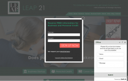
Here is an example of animation that makes it clear what you want your visitor to do next:
3. Engaging the Visitor
Animations serve a purpose for visitors or at least aesthetically tell a story. This keeps visitors engaged for longer.
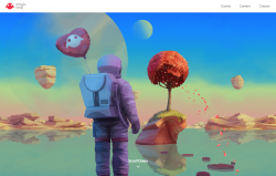
Here are some animated story telling website examples:
Sometimes less is more as well. Entice your users to keep reading with subtle content animation. The right kind of animation can demonstrate information hierarchy, encourage exploration, and delight users.
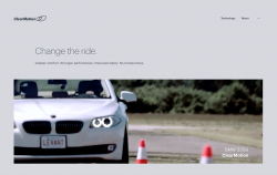
Here are some examples with subtle content animation:
4. Communicate an Action
You can always type out instructions or direction onto your website but there are certain animations that help you communicate your message while also keeping the look and layout clean. For example, form entry can be greatly enhanced with some animation. If correct data has been entered, a simple ‘nod’ animation can be introduced upon completion. Whereas a horizontal shake can be used when denying the input. When users notice such animation they instantly understand the action.
5. Cleaning Up Layout
Animation can be used to bring in or remove unnecessary elements in the layout. A flexible header is a great example of that. A header contains some of the most useful functions of a website, actions that need to be available on every page. What happens when the user scrolls down? A header that sticks to the top of the browser, but folds away neatly can keep those functions accessible without taking up too much screen space.
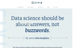
Here are some examples of headers that clean up well as you scroll down:
Does your website need some animation?
Our design and development team can work with you to improve user experience and contribute to the success of your marketing goals.
Whether you are ready for a complete re-design, or want to embellish an existing website, Website Heads can help you get things moving.
Click Here to
Tags: aesthetic, animate, animation, attention, attracting, business, clean, design, development, elements, Engaging, examples, flexible, function, guide, header, information, layout, marketing goals, modern, movement, process, stick, story, subtle, technology, trend, user experience, visitors, web, web design, website
Categorised in: General, Web Design Trends
This post was written by websiteheads

