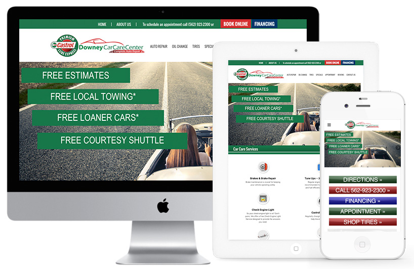
Responsive Website Design
August 3, 2017 8:35 pm Leave your thoughts 
What is Responsive Web design?
Responsive website design (RWD) is an approach to web design aimed at allowing desktop webpages to be viewed in response to the size of the screen or web browser one is viewing with. In addition it’s important to understand that Responsive Web Design tasks include offering the same support to a variety of devices for a single website. Responsive design is an approach to web page creation that makes use of flexible layouts, flexible images and styles. The goal of responsive design is to compile web pages that detect the visitor’s screen size and orientation and change the layout properly.
Responsive Web design is the approach that suggests that design and development should respond to the user’s behavior and environment based on screen size, platform and orientation.
The practice consists of a mix of flexible grids and layouts, images and an intelligent use of CSS media queries. As the user switches from their laptop to iPad, the website should automatically switch to accommodate for resolution, image size and scripting abilities. In other words, the website should have the technology to automatically respond to the user’s preferences. This would eliminate the need for a different design and development phase for each new gadget on the market.
Why Use Responsive Website Design?
We’re quickly getting to the point of being unable to keep up with the endless new resolutions and devices in the field of Web design and development. For many websites, creating a website version for each resolution and new device would be impossible, or at least impractical. Web Designers have developed a way to combat this issue, leave no device dimension left behind, and get rid the consequence of losing potential visitors from one device.
Responsive web design has become more important as the amount of mobile traffic now accounts for more than half of total internet traffic. Therefore, Google announced Mobilegeddon (April 21, 2015) and started to boost the ratings of sites that are mobile friendly if the search was made from a mobile device. Responsive web design is an example of user interface plasticity.
Ready to add a responsive layout to your website?
Click Here to
Tags: cross browser, CSS, development, devices, dimensions, flexible, google, Mobilegeddon, modern layout, orientation, resolutions, respond, responsive, responsive web design, responsive website design, screen dimensions, website design
Categorised in: General
This post was written by websiteheads
